I saw this chart and caught my attention, not because of the data it tries to convey, but the cognitive load it gave me.
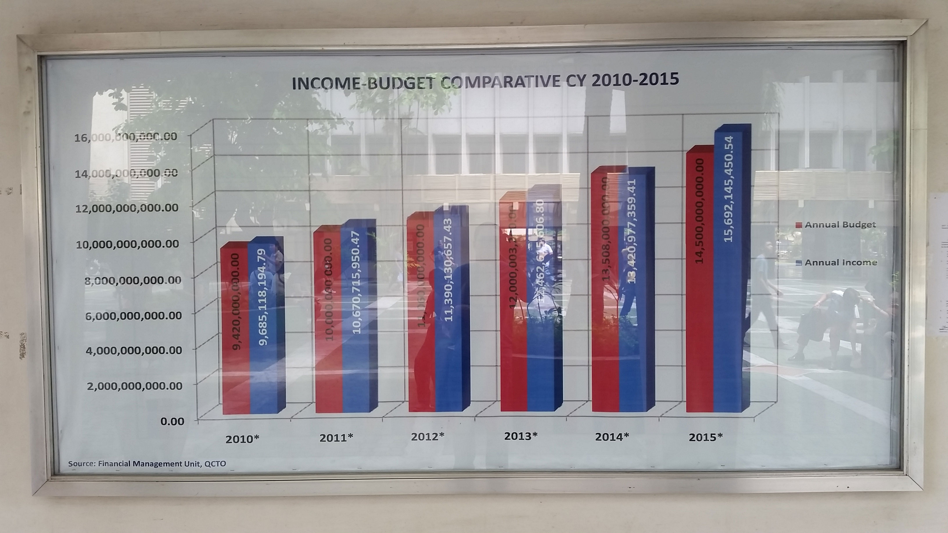
Before, all charts look the same. It really doesn’t bother what or how people present them. After learning data visualization, it gave me mental cues how it should be presented.
Here’s my take and redo of the graph:
- Let the data take center stage
- A two-series line graph is more suited to plot this continuous data. It implies a connection all through out. Not just subdividing the budget vs income per year, but shows the relationship or gap per year.
- Strip off anything that isn’t adding informative value
- Like never use 3D, especially in single dimension
- Remove the gridlines. But if you think it will be helpful for your audience to trace their finger from the data to the axis, or you feel that your data will be more effectively processed, you can leave the gridlines. But make them thin and use a light color like grey.
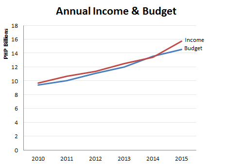
Any time you put information in front of your audience, you are creating cognitive load and asking them to use their brain power to process that information. Visual clutter creates excessive cognitive load that can hinder the transmission of your message.